Terminology: What Is Switchblade Minimalism? A Manifesto.
Most aesthetic labels are descriptive. They tell you what something looks like: quiet luxury means expensive neutrals with no logos, dark academia means tweed and candlelight and old books, clean girl means dewy skin and a reusable tote.
Switchblade Minimalism is different. It's not a description of a look; it's a description of a tension.
The tension between restraint and edge. Between the heirloom and the industrial. Between the object you'd find in a museum of contemporary art and the band tee worn until it knows the shape of your body. Between the sculpture and the weapon. Between something that lasts a hundred years and something that looks dangerous right now.
That tension is the whole point. Resolve it in either direction and you get something less interesting. Lean too far into restraint and you get the expensive blandness of mainstream luxury. Lean too far into edge and you get costume, performance, the theatrical version of an aesthetic that should never need a stage.
Stay in the tension and you get something that has never quite existed before.
WHERE IT COMES FROM
The name is deliberate. A switchblade is elegant, precise, and contained right up until the moment it isn't. It has the visual restraint of a well-made object and the implied reality of something designed with a lethal purpose. There's nothing decorative about it - every element is exactly what it needs to be and nothing more.
Minimalism, in its actual meaning rather than its Pinterest interpretation, is the same thing. It's not about softness or neutrality or the absence of anything that might disturb. It's about ruthless editing, keeping only what earns its place, removing everything that exists for appearance's sake rather than for genuine purpose.
Put those two things together and you get an aesthetic that is simultaneously spare and dangerous. Quiet and weighted. Refined and absolutely unwilling to apologize for what it is.
WHAT IT LOOKS LIKE
Switchblade Minimalism lives in specific places:
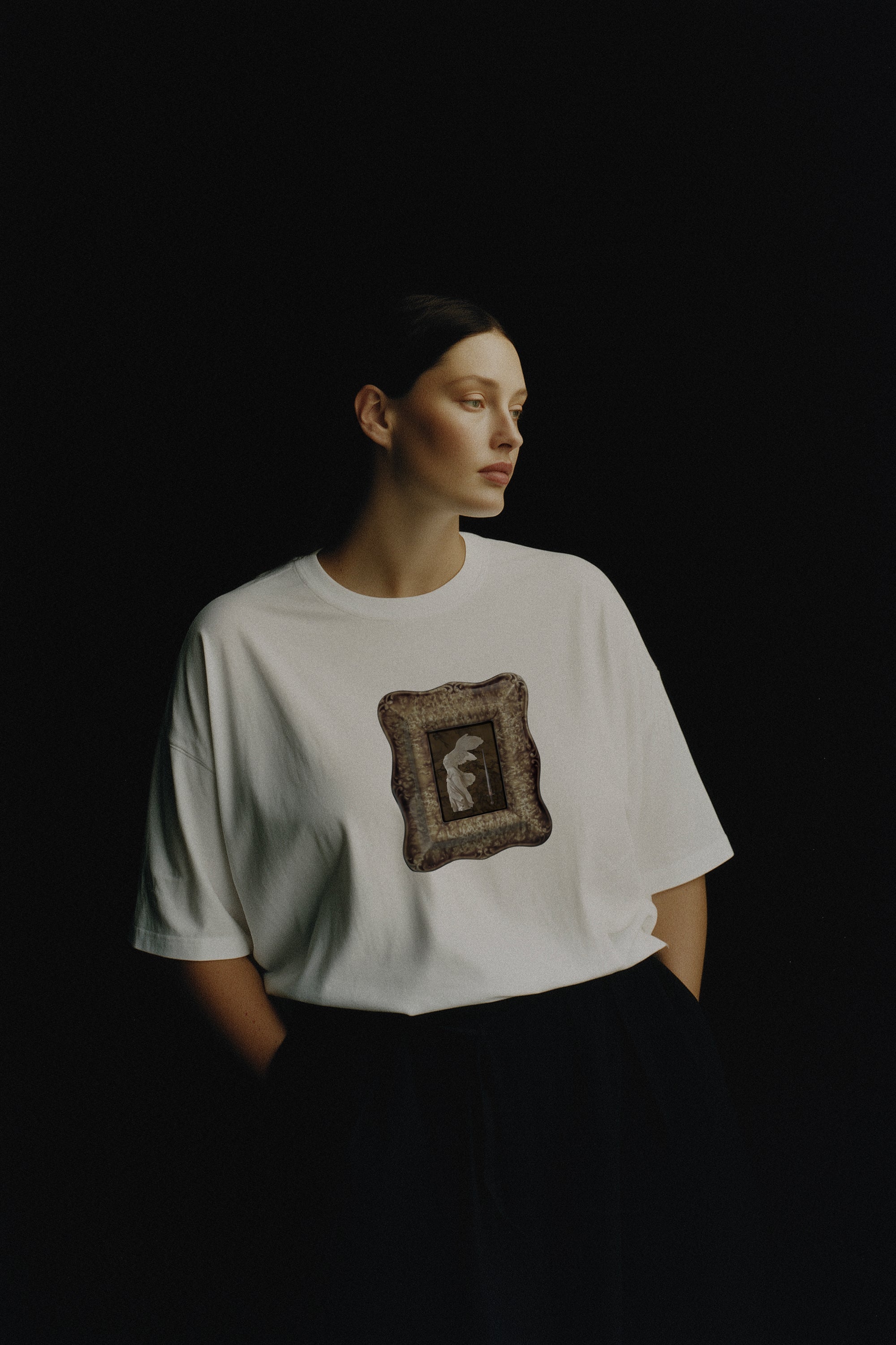
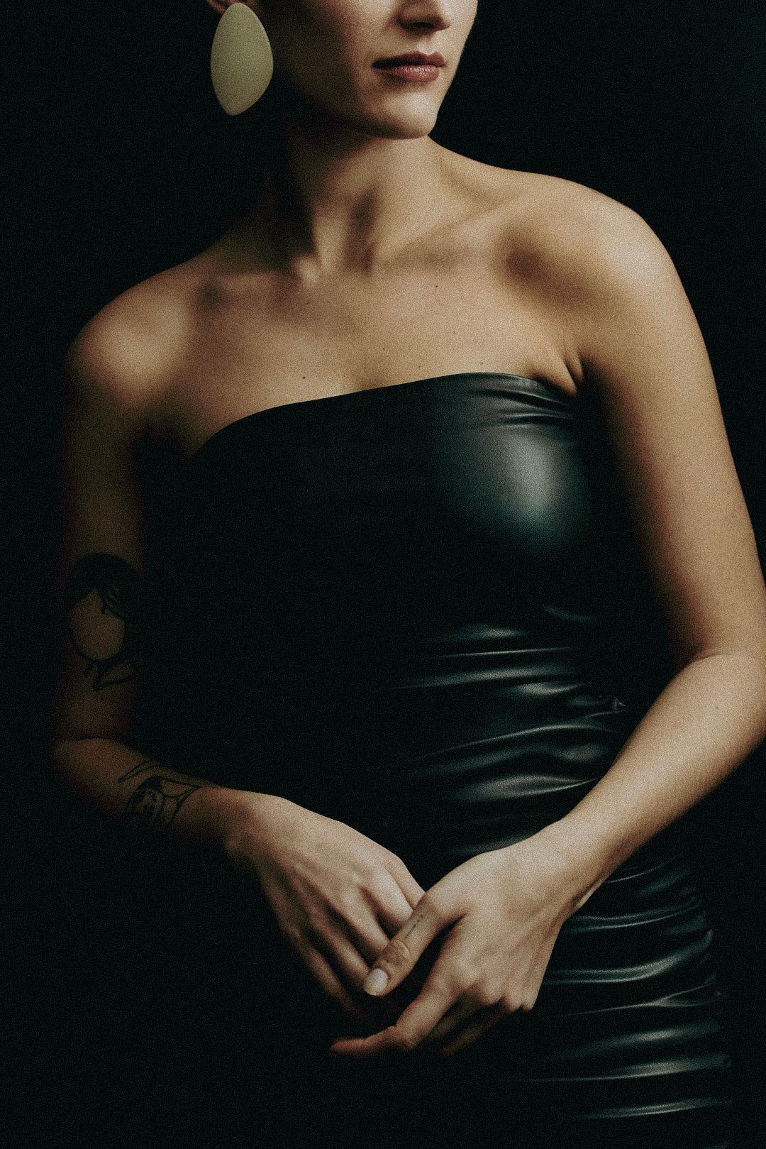
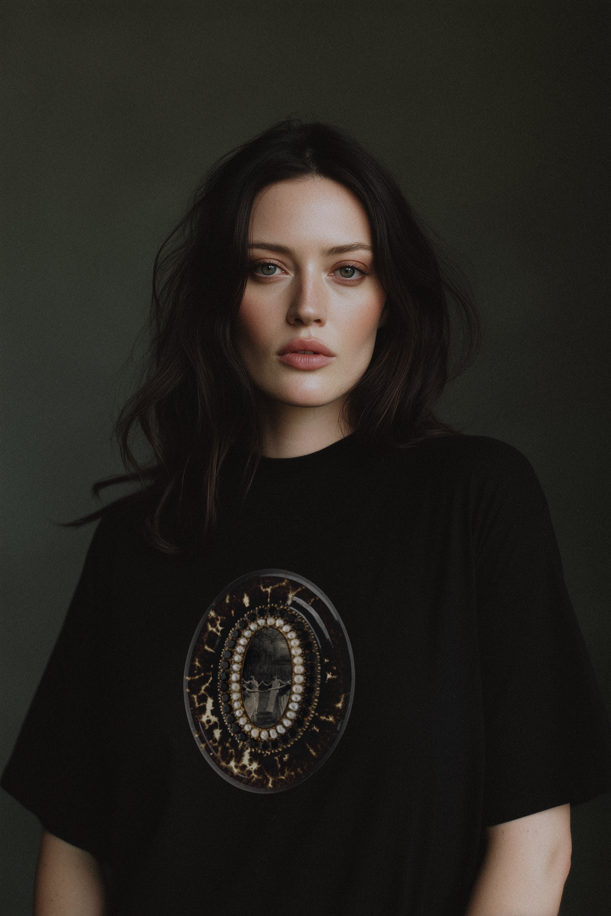
In heavyweight fabrics that have enough density to hold their shape and enough presence to change how you stand when you're wearing them. Not thin things trying to look substantial, actual weight, actual drape, actual authority.
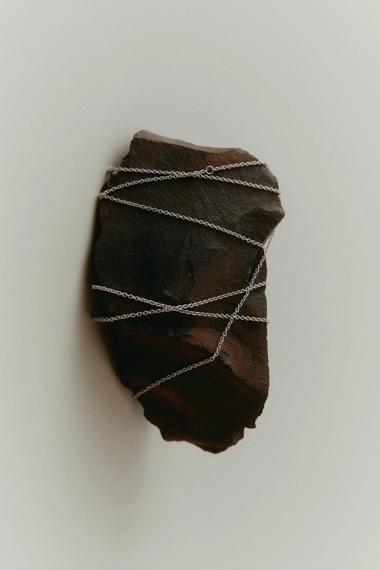
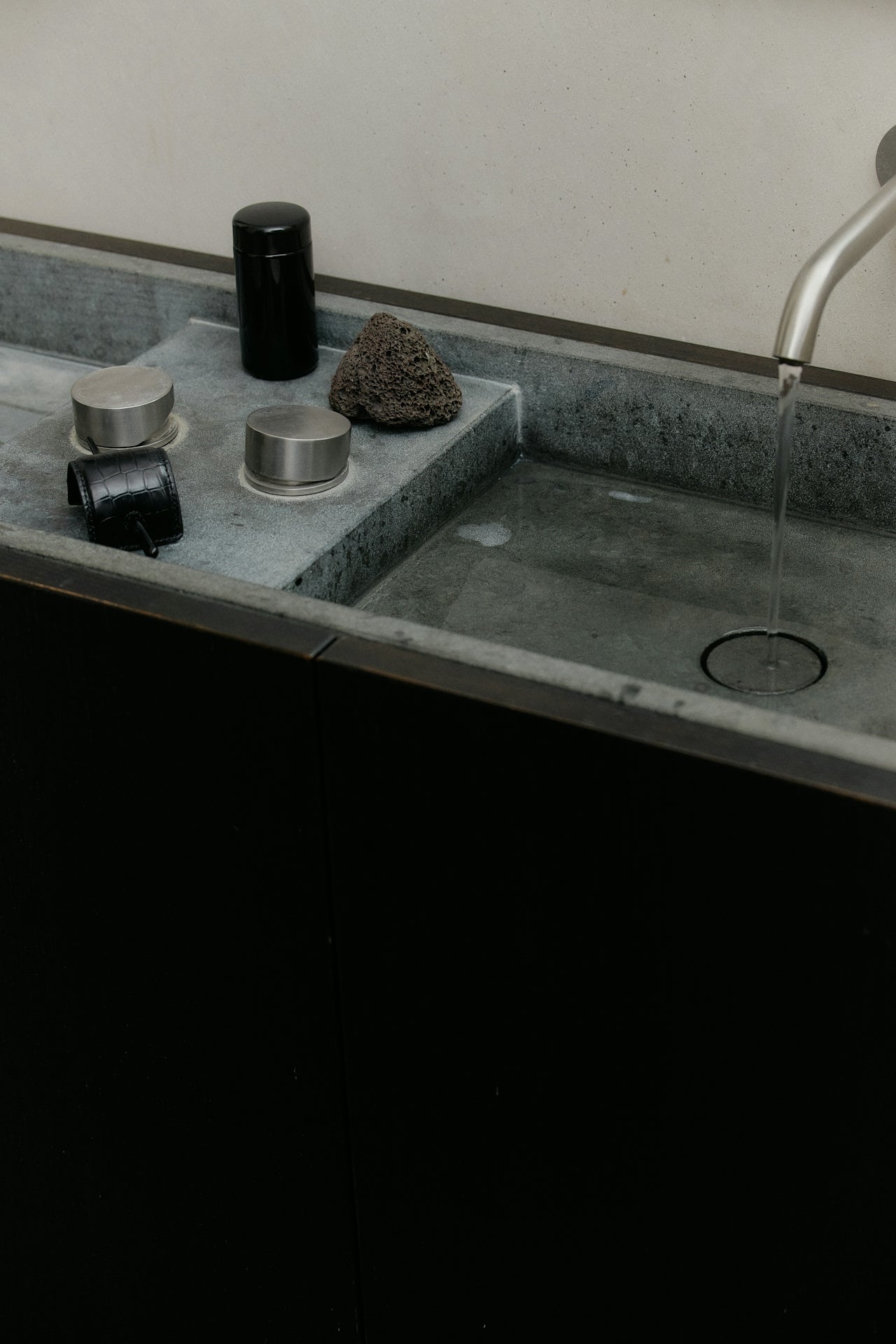
In industrial materials used with the same care you'd give something precious: oxidized metal, raw concrete, scorched wood, volcanic stone. Materials that show their age and their process and their honesty, that don't pretend to be softer than they are.
In objects that could reasonably live in a gallery and in your home simultaneously. A candle that looks like architecture, a piece of jewelry that looks like it was excavated rather than made, a garment that looks like it was designed by someone who also thinks seriously about buildings.
In the specific moment where something looks dangerous and feels like home.
WHAT IT ISN'T
It isn't goth, goth is theatrical. Switchblade Minimalism has no interest in performance or in being seen as a type. The point is not to signal membership in a subculture. The point is to find the exact thing that matches what's already living inside you, which requires no explanation because it isn't communicating to an audience.
It isn't Rick Owens. Rick Owens is aggressive. Switchblade Minimalism is quiet. The edge is implied rather than announced. The danger is in the restraint, not the volume.
It isn't quiet luxury. Quiet luxury is safe. It's the aesthetic of wealth that doesn't want to disturb anyone. Switchblade Minimalism doesn't care about disturbing anyone but it also isn't trying to. It simply has a conviction that quiet luxury has carefully engineered out of itself.
It isn't sustainable fashion, or rather, it isn't only that. The high integrity production practices are there, small batch, materials chosen for longevity, pieces designed to be kept for decades. But the aesthetic doesn't look like sustainability marketing. It doesn't look like anything other than exactly what it is.
WHO IT'S FOR
The woman who has spent years feeling like the market was making things for someone slightly different from her. Close, often, but not quite.
The one who knows what she wants with precision but has struggled to find it expressed anywhere outside her own head. Who has a wardrobe full of almost-right pieces and a clear internal sense of what would actually be right.
Who has outgrown the need to explain her taste to anyone and is looking for the thing that simply confirms it.
She isn't building a wardrobe, she's building an archive. Collecting artifacts over time that reflect a specific vision of what objects can be and what clothing can do. Not chasing trends, not filling seasonal gaps, but finding the exact pieces that have genuine weight and keeping them for a long time.
She doesn't want to look alternative, she wants to look inevitable.
WHY THIS EXISTS
Double Kick was built from the inside of that frustration. After years of looking for something that held the sculpture and the band tee in the same breath, the heirloom quality and the industrial aesthetic, the refinement and the edge, without choosing between them or softening either.
The gap was real. My answer was to fill it.
Every piece in the Double Kick archive exists because it passed a specific test: does it live in the tension without resolving it? Does it have the restraint of minimalism and the conviction of something genuinely dangerous? Does it look like it was made by someone with a clear point of view who refused to sand the corners off?
That's the standard. Everything else is noise.
—Sara
Founder & Creative Director